“It can be a fascinating game, noticing how any person with vitality and vigor will have a little splash of red in a costume, in a room, or in a garden… ”
-Edgar Cayce
It’s that time of year again, when Pantone, THE color folks, announce their color of year. The choice for 2015? PANTONE 18-1438 Marsala.
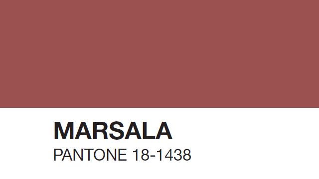
Initial thoughts? It’s not too bright and not too dramatic. It’s pretty and a little playful. If it looks familiar, it’s because you’ve probably seen it showing up in fashion and beauty. Trends are trends, and home design is no exception.
Marsala is a shade that could provide the perfect pop of color. And to be honest, sometimes a pop is all you need!
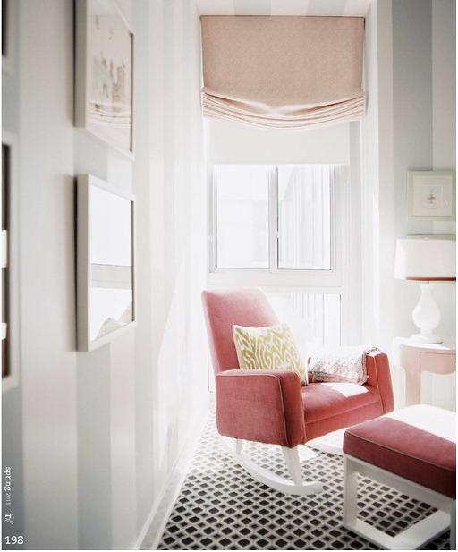
I love color and think it should be incorporated into every space. But I also like balance and believe the structures and materials that make up a room are what you focus on. You take your cues from the wood and brick and tile and other strong, grounded elements that are the literal and figurative foundation for your space. Then you complement them.
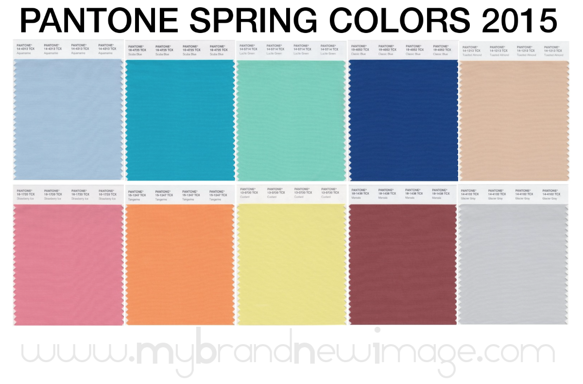
Pantone’s color of the year will get most of the attention, but she is actually part of an entire palette for spring. A beautiful, sherbet-filled spectrum of colors you could imagine seeing in nature. Speaking of, when you ask for earth tones, take a peek out the window – you rarely see all beige!
So as the world absorbs this hot new shade, I will anxiously await the arrival of on-trend goodies at all my design and furniture houses. Are you ready to add a splash of Marsala, or anything else on the rainbow for that matter, to your home? Wondering where to start?
Here’s a tip…think about the season you’re drawn to. Do you love the rust, olive and chocolate of fall? Or does the black, white and grey of winter speak to you? Pastels of spring or the greens, mid-tones and cheer of summer? Start there and then let’s talk about it!
Comments are closed.