A is for Apple, D is for Design
It’s September and school is back in session. What better time to share some adult CliffsNotes. From A to Z, here are 26 of our favorite lessons learned.
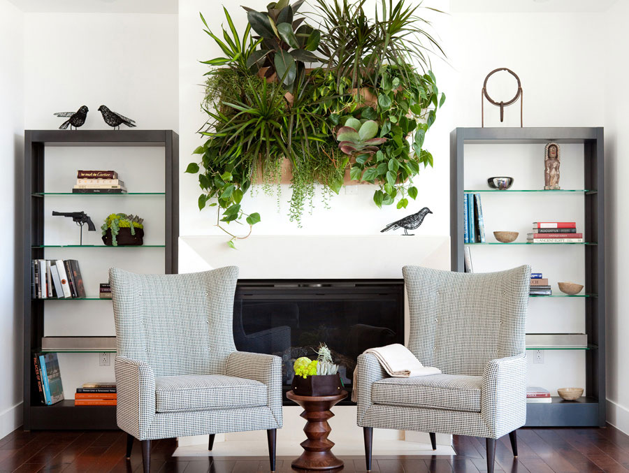
Accessorize – This is the best way to reflect your personal style.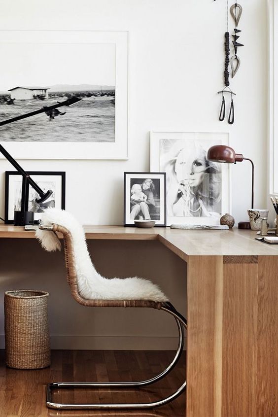
Budget – Be realistic and make sure you set one. This can make or break any project.
Classic modern – This is by far our favorite style for kitchens and bathrooms. Black, white, chrome…these things endure and look timeless.
Don’t bite off more than you can chew – Major redesign and remodel isn’t for the faint of heart. Know what you can handle!
Elegance – Straight lines are clean and classic, but everyone needs some curves.
Functionality – Always keep this in mind. Even the most well-designed home is meant to be lived in.
Go Shopping – Touch, feel and sit on things before you buy them.
Have a sense of humor – This applies to most things in life, and design is no different. There will always be issues, sometimes you just have to laugh and keep going.
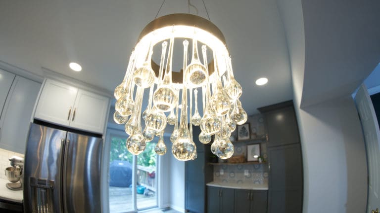
Innovation – It’s 2016 and there are gadgets for everything. Experiment with lighting and incorporate technology into designs (charging station anyone?).
Junk is bad – Purge what you don’t need.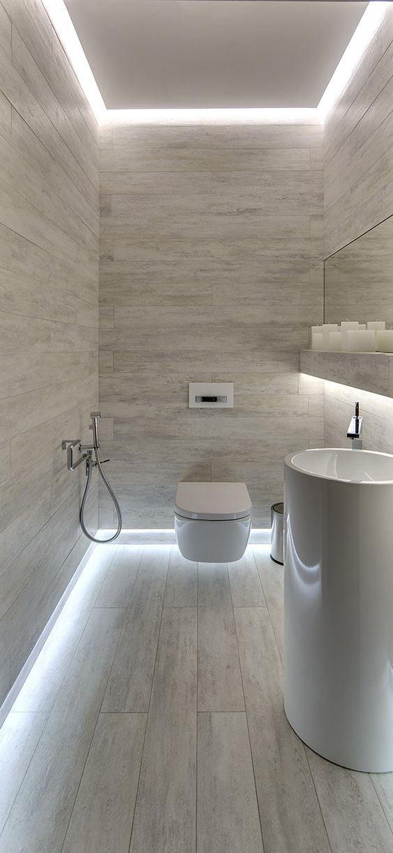
Kitchens – These are the center of the home (and often what sells them). Spend your money here.
Love – Make sure you’re really enamored with every choice you make.
Mix – Textures, patterns, fabrics. It’s okay to mix it all up.
Never give up – Keep up with the maintenance of your home. Prioritize projects and take the time you need. We recommend one big project a year.
Organizing – It’s important. Streamline and hire an expert if you need help.
Personalize your space – Your story, your style make your home.
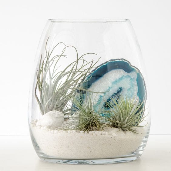
Quick and dirty – There are plenty of do-it-yourself updates you can take care of in a weekend (terrariums, accent wall, furniture rearranging).
Rooms have a purpose – Honor the space for what it is (e.g. – bedroom, calm, peaceful).
Style – What’s yours? This is the first question we always ask. Think about it before you begin.
Textiles – Rugs, throws, pillows, window treatments…they all add texture and feeling. Go crazy!
Urban elements – A little city flair goes a long way. Brick accent wall, wrought iron and reclaimed wood furniture. Think outside the box and pay homage to your neighbors to the north and south.
Vintage – Every space needs something old (and something new). Antique stores, thrift shops and family heirlooms all fit.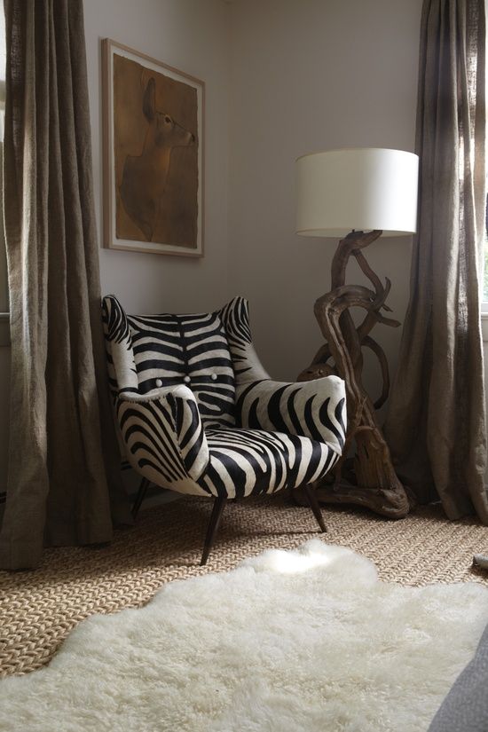
Wall paper – Despite its occasionally dated reputation, wall paper is always in. There are infinite patterns and options.
(e)Xterior – So we stretched a little here, but you know what we mean. It’s not just about the inside. Pay attention to the outside of your home as well. First impressions people!
Your passion – This is right up there with style. What do you love, where do you vacation? These things all inform good design that reflects you and your family.
Zebra prints – Enough said.

